
In digital interfaces, typography is more than just the visual style of text; it acts as a critical conduit for user comprehension and engagement. The careful orchestration of font choice, size, spacing, weight, and alignment directly influences how users perceive, process, and act upon information. At its core, typography flow engineering is about shaping the reading experience to be seamless, intuitive, and cognitively effortless, enhancing the overall user experience (UX) without drawing attention to the mechanics themselves.
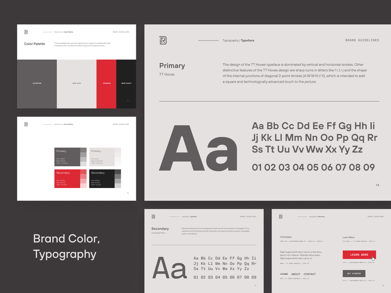
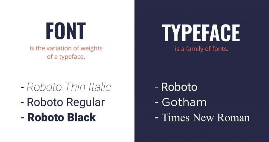
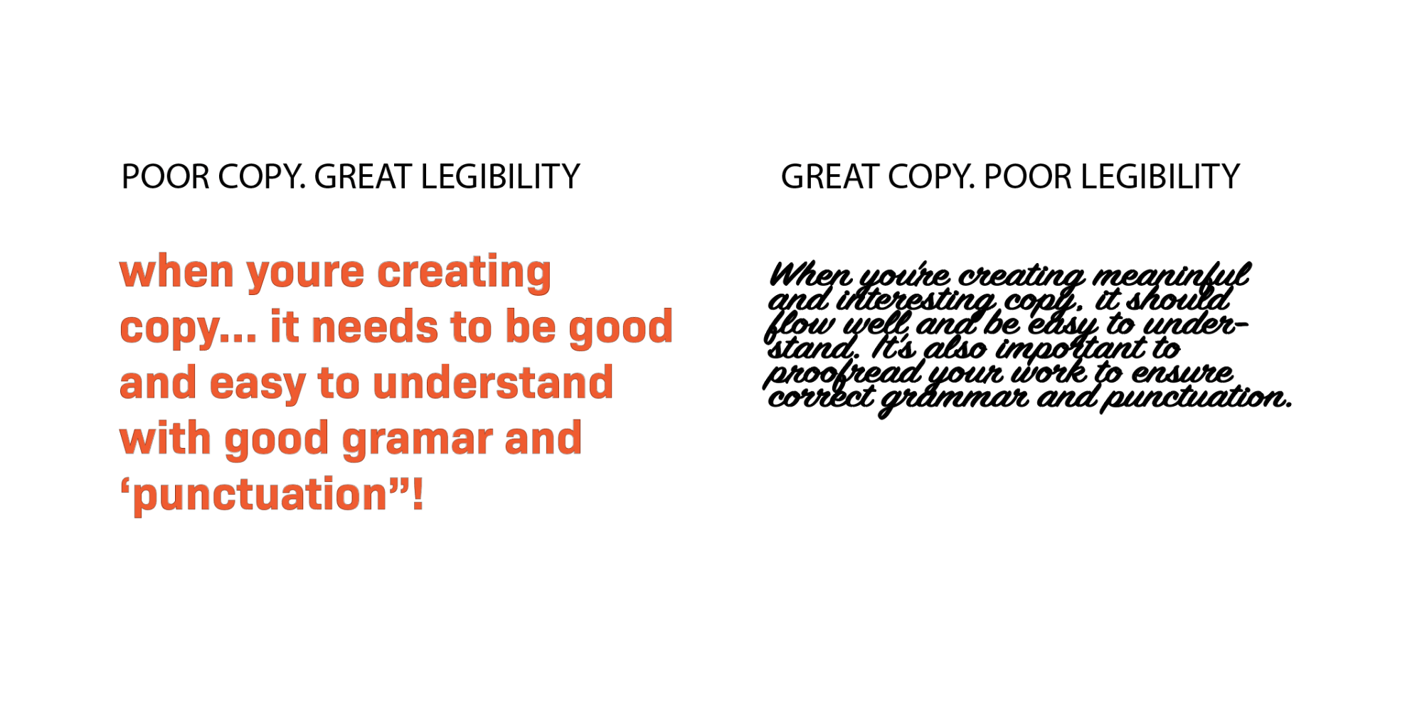
Effective typography begins with clarity. Choosing a typeface that supports legibility is paramount. Sans-serif fonts often provide clean, modern lines that perform well on screens, while serif fonts can convey tradition and authority when used thoughtfully. Beyond mere aesthetics, font selection must consider the context in which the text appears. Small, dense paragraphs require highly readable fonts to reduce cognitive load, while larger headings allow more stylistic freedom to establish hierarchy and tone. By matching typefaces to content roles, designers ensure that users can navigate information efficiently and with minimal friction.
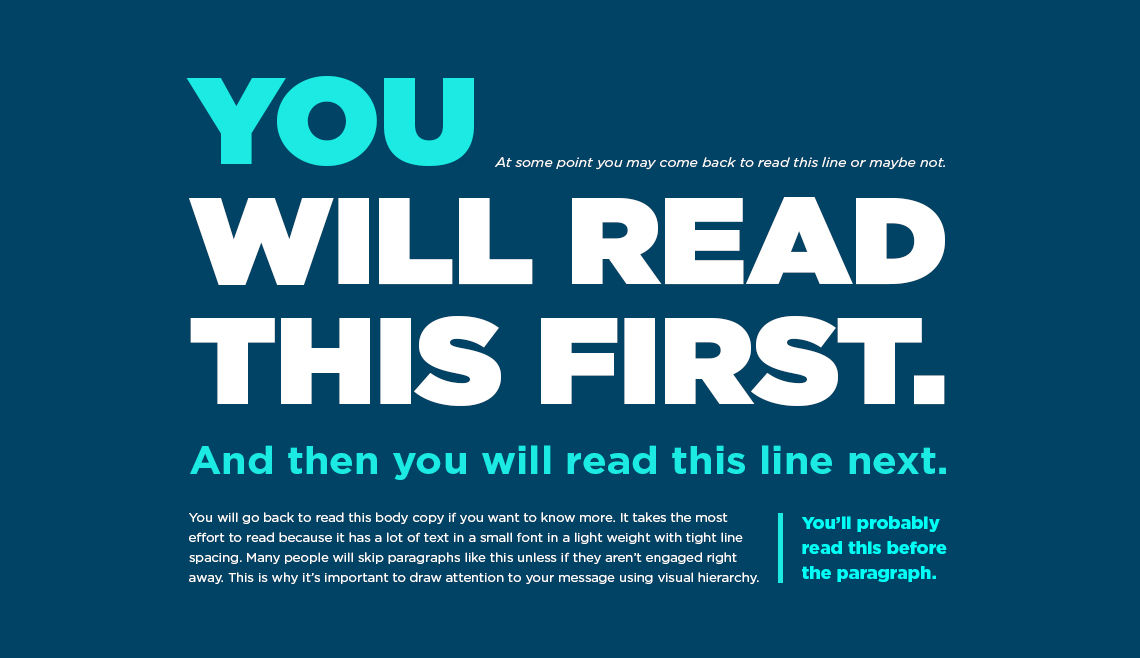
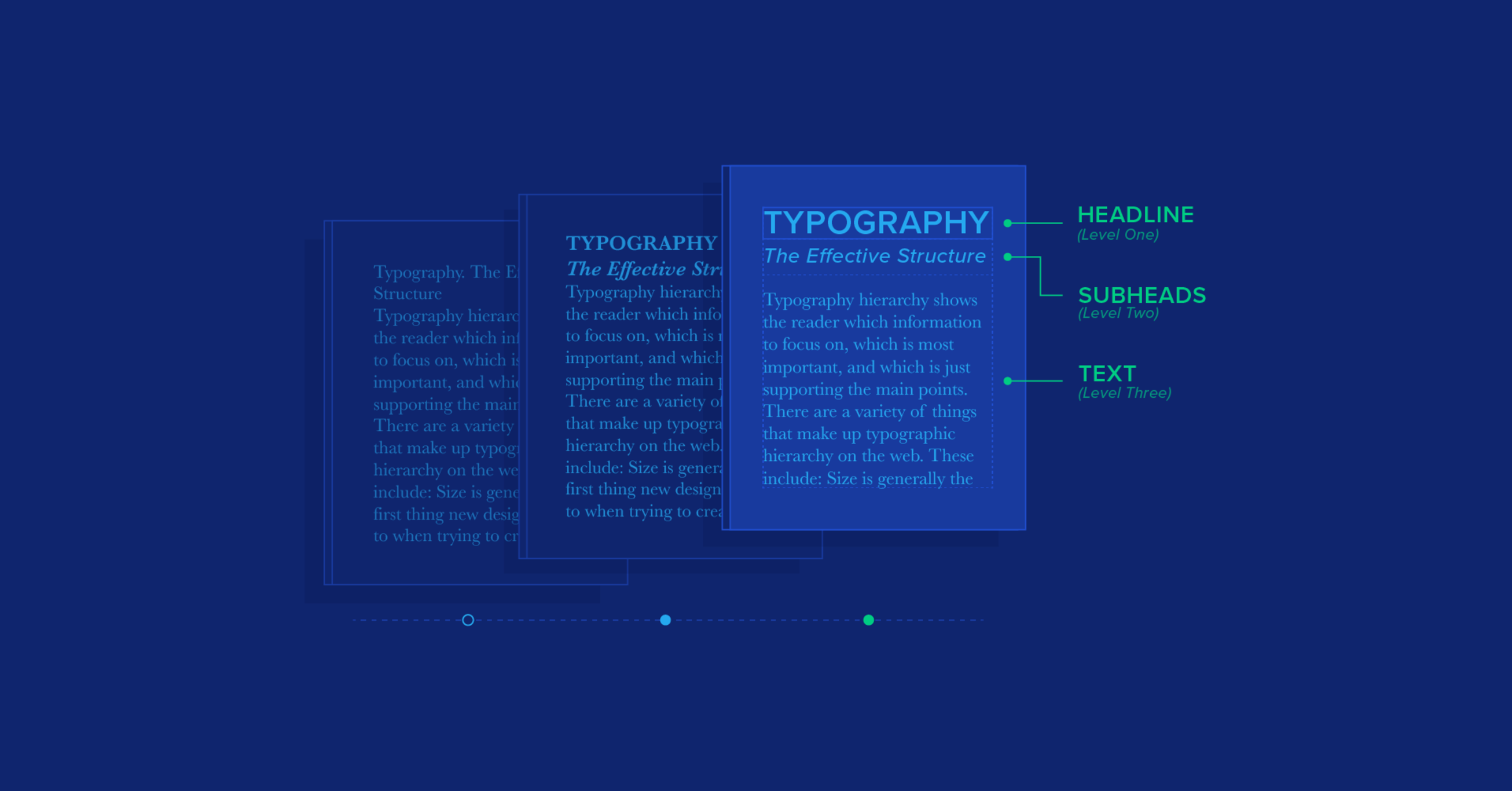
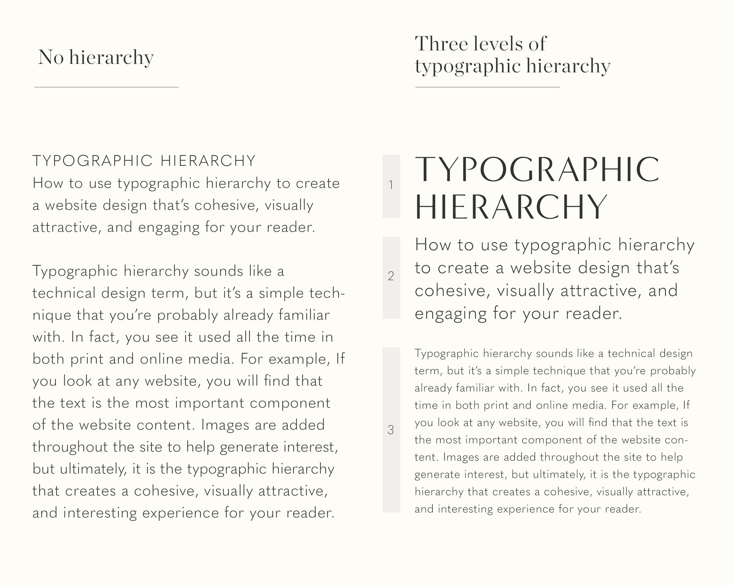
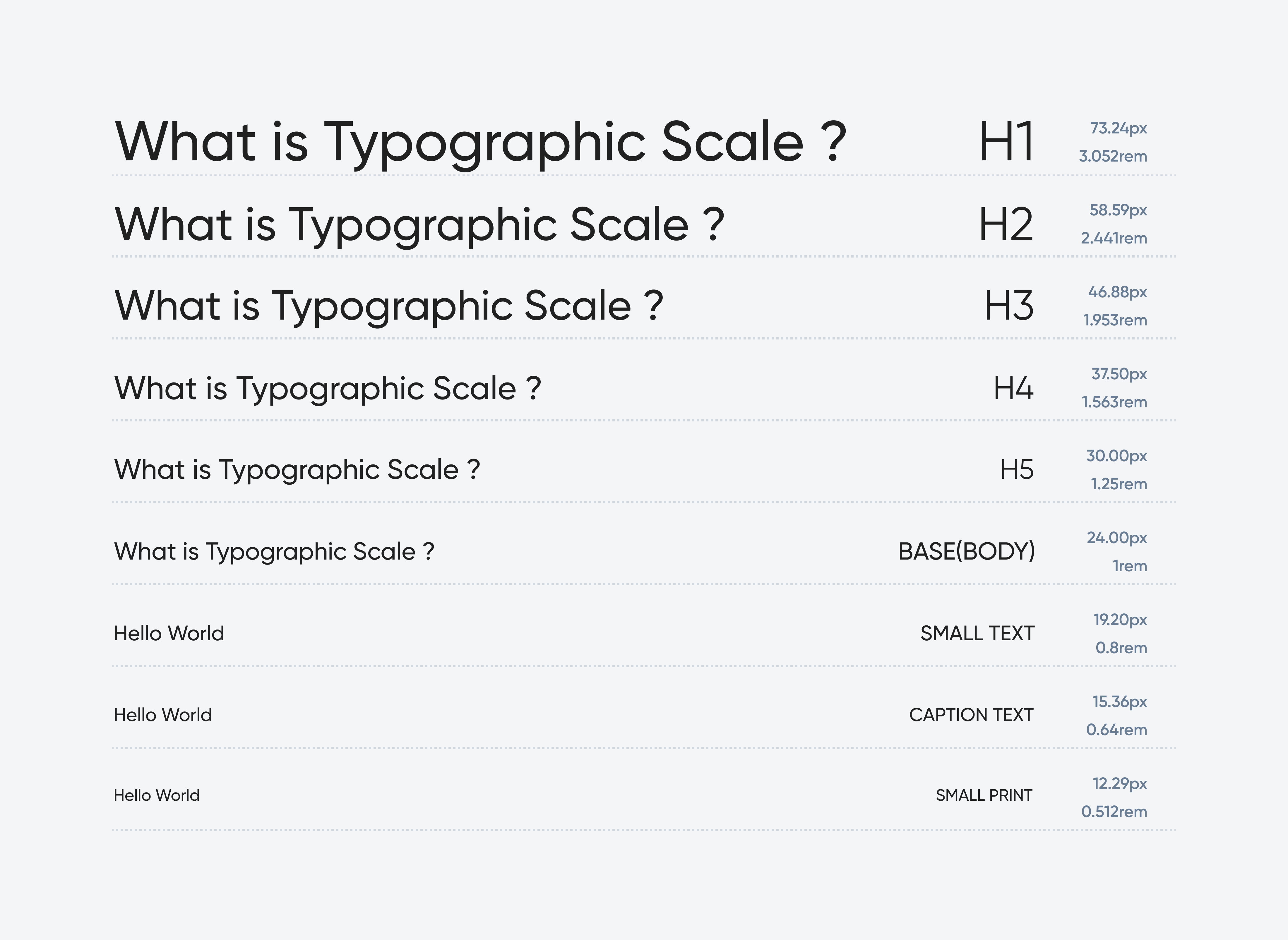
Hierarchy and structure are fundamental principles in typography flow. Users typically scan screens rather than read linearly, making it essential to guide attention strategically. Differentiating headings, subheadings, and body text through size, weight, or color establishes a visual roadmap that communicates relationships between pieces of content. Proper use of spacing, both between lines (leading) and between letters (tracking), enhances readability by preventing the text from feeling cramped or disjointed. Margins and padding also play a significant role, as they create breathing room and maintain a rhythm that aligns with natural reading patterns.
Consistency across the interface is another cornerstone of readable UX. When typographic styles shift unpredictably, users expend mental energy reconciling inconsistencies, leading to confusion and frustration. Establishing a typographic system that defines font families, sizes, weights, and spacing rules for various content elements promotes a unified experience. This system serves as a framework for both designers and developers, ensuring that updates or additions to the interface maintain coherence. It also supports scalability, allowing interfaces to adapt to multiple devices and screen sizes without compromising readability.
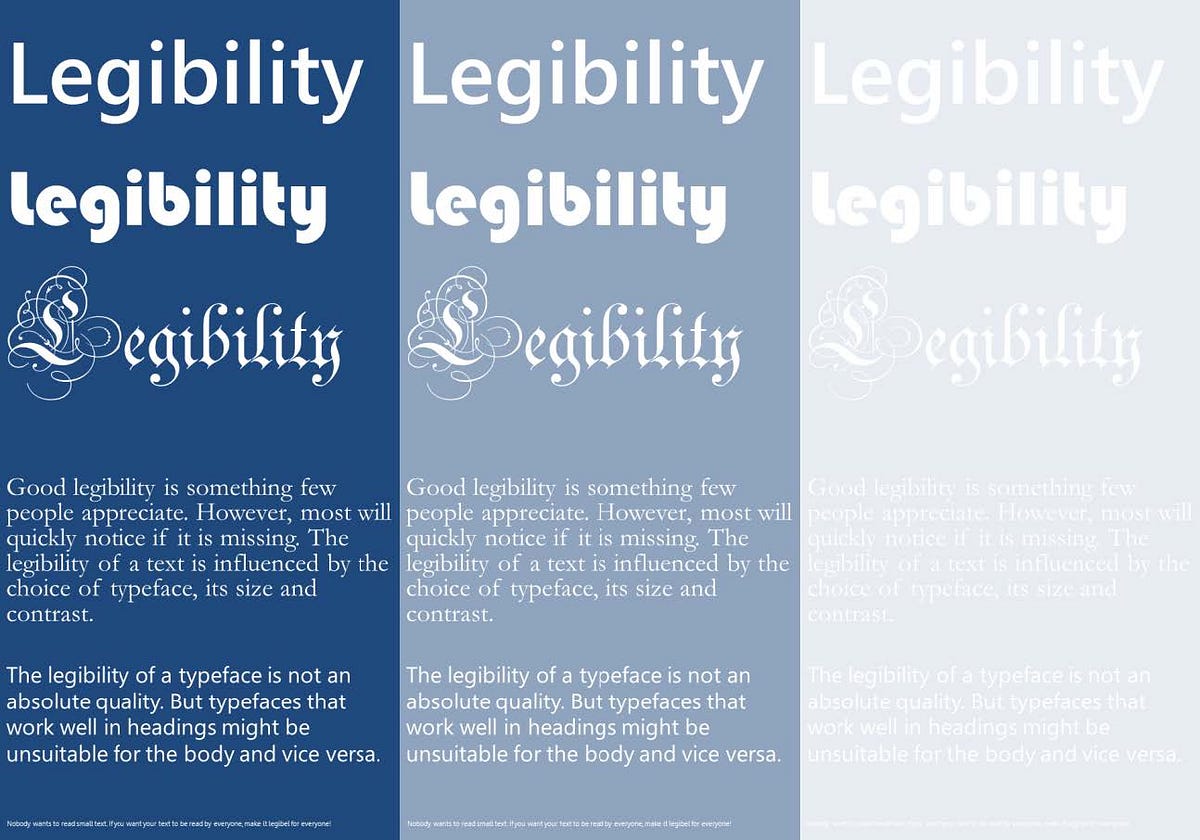
Attention to contrast enhances the legibility and comprehension of text. Adequate contrast between text and background is necessary to accommodate users with varying visual abilities, including those with low vision or color perception differences. High contrast ensures that text remains distinguishable in diverse lighting conditions and on different displays. Additionally, typographic emphasis techniques such as bolding or italicizing text must be used judiciously to signal importance without overwhelming the user. Overuse of emphasis can dilute its effect and disrupt the natural reading rhythm, reducing the clarity of information delivery.
Responsive typography is essential in modern UX design, given the wide range of devices users employ. Text must adapt fluidly to different screen sizes, orientations, and resolutions, preserving readability and flow. Techniques such as relative font sizing, flexible line lengths, and scalable leading allow content to maintain its visual hierarchy and legibility across contexts. Designers often test typography on various devices to ensure that line breaks, word wrapping, and paragraph spacing do not hinder comprehension. This responsiveness extends to accessibility, supporting features like dynamic text resizing or screen reader compatibility.
Micro-interactions and content timing also intersect with typography flow engineering. Animations that reveal text, scroll-triggered effects, or gradual fade-ins can draw attention to key content without overwhelming users. However, these interactions must be subtle and purposeful; excessive movement can distract or fatigue readers, breaking the cognitive flow necessary for comprehension. When integrated thoughtfully, these dynamics enhance engagement and guide users through content intuitively, reinforcing hierarchy and contextual relevance.
Typography is not only about static text but also about rhythm and pacing. The sequence of information presentation influences how users internalize messages. Long blocks of uninterrupted text can overwhelm users, while strategic use of headings, lists, and paragraph breaks encourages scanning and comprehension. Bullet points, numbered lists, and spacing variations act as cognitive signposts, allowing readers to parse complex information efficiently. By considering the natural cadence of reading, designers facilitate a smoother journey through content, reducing cognitive friction and enhancing retention.
In addition to visual and structural considerations, cultural and linguistic factors impact typography flow. Different languages have unique character sets, word lengths, and reading directions, all of which influence layout and spacing decisions. For multilingual interfaces, designers must account for these variations to maintain consistent readability and user experience. Localized typographic rules, such as appropriate line length or punctuation spacing, ensure that content feels natural and legible to diverse audiences, reinforcing accessibility and inclusivity.
Testing and iteration are critical in refining typographic flow. User testing, including A/B comparisons, heatmaps, and eye-tracking studies, provides insight into how typography affects comprehension and engagement. Feedback on readability, visual fatigue, or navigation efficiency informs adjustments to font size, spacing, and hierarchy. Iterative refinements grounded in user behavior help designers align the typographic system with cognitive patterns, ensuring that the interface communicates effectively while remaining aesthetically pleasing.
Ultimately, typography flow engineering bridges the gap between visual design and cognitive processing. By meticulously managing clarity, hierarchy, consistency, contrast, responsiveness, pacing, cultural considerations, and user feedback, designers create interfaces where text serves its purpose unobtrusively. Users navigate information effortlessly, absorb content efficiently, and experience minimal cognitive strain, leading to higher satisfaction and deeper engagement. When typography flows harmoniously, it becomes invisible, allowing the interface itself to support comprehension, decision-making, and user confidence. The seamless orchestration of these elements transforms text from static content into a dynamic, readable, and engaging component of user experience.


Leave a Reply